Microwave interface: so simple, so broken
If you want to use a microwave ovens your task is pretty simple: you want to heat something. The variables involved in accomplishing your goal are:
- what are you heating?
- how hot do you want it?
That's it. Then why is nearly every microwave I've ever used so complicated? For example, I give you the microwave at my closest work kitchenette:
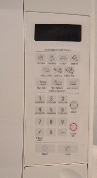
The primary problems come from button placement. Why are 'Custom' functions at the top? For most tasks you just need the 'start and add 30 seconds for every press' button. And, to its credit, this microwave does have it. Can you find it at a glance? Me neither. (It's next to the 'Stop' button.) Problems with it:
- You have to lean close to the thing to read the small print on it. Why not just a '+0:30' without the clock or 'sec' on it?
- The coloring doesn't indicate its purpose, so if you do hit it
by accident you'll probably be startled by the microwave being
activated.
</ul>
Another notable violation the 'Start' button. Except for the tough-to-find 30 second button every single use of this microwave will involve that button. So why is it:
- situated in the middle of the other buttons? I guess we should be thankful it's at least on an edge so it's easier to hit.
- colored the same as the other buttons? (even though the 'Stop' button is marked red) </ul>
- Why are the two largest buttons 'Timer' and 'Clock' (at the bottom)? 'Timer' I can see because people use microwaves as timing devices all the time. But 'Clock'? How often do you set the thing? Does it really deserve that large a button? My thinking is that the designers figure they're related, so why not put them next to one another. And if they're next to one another, they have to be the same size, right?
- The food groupings are kind of odd. Besides their weird location, you have 'Fresh' and 'Frozen' vegetables. But different types of vegetables need to be cooked for different amounts of time -- cooking asparagus and broccoli for the same time would bring seriously undesirable results.
- 'Snacks'? 'Reheat'? The only one of those that really makes sense is 'Popcorn', but...
- ...as anyone who has worked in an office with other people will
tell you, there's always some asshole who puts popcorn in a microwave
and then forgets about it and lets it cook for the full 'Popcorn'
cycle. For all microwave popcorn I've encountered this turns out to
be 30 seconds too long, and that's sufficient to fill a surprising
amount of space with the horrible smell of charred popcorn for about
20 minutes. And it only takes about two and a half minutes to
cook. So the person who walks away from the popcorn does so for what?
To check email? To shift-reload foxnews.com again to get their talking points to the brilliant ideas
our brainless president has barfed out this week? No, their time is
much too valuable to sit around and wait for popcorn.
(You'd could argue that this isn't a microwave design problem. But what if they reduced the 'Popcorn' cycle by 30 or 45 seconds? Think of all the noses saved!)
</ul>
The coloring thing is what gets me angry almost as much as the placement. I could almost understand if none of the buttons had coloring. But that's not true, the 'Stop' button has a red circle. So why not make every button that makes the microwave run green? Or the 'handy' shortcut buttons up top purple so your eye will group them together separate from the rest. (And why are they on top anyway?)
A couple other minor issues: